Alternative content formats using Blackboard Ally
Download alternative formats of content in Blackboard by using the Ally feature.
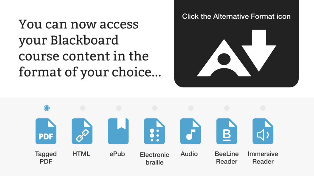
Blackboard Ally helps you get the most from your course resources by automatically converting content into a variety of formats, from HTML and e-book for reading on mobile devices, to Electronic Braille for the visually impaired, and audio for learning whilst on the go.
Alternative formats provide greater opportunities for everyone to access the information you need in the way you want it.
You can use the “File Transformer” to upload a file and download it in an alternative format. You can personalize your learning experience to better fit your needs, devices and learning preferences.

How to use Blackboard Ally
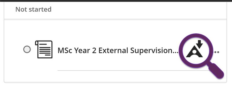
In your course you will notice an icon to the right of the majority of files. Select this icon and then select Alternative Formats. You can then choose the version that is best for you and select ‘Download’. This short video on Ally for Students will demonstrate how.

Further Information
Writing with Accessibility in Mind
Making your documents accessible means that you are trying to ensure that your content can be read and understood by as wide an audience as possible. View the resources below for some basic guidelines when creating documents. These skills will be invaluable in the workplace and on placements.
Microsoft Word has many features built-in that help people with different abilities to read and author documents.
It is important you understand how to make you documents accessible at the point of creation.
The following guidelines will help you make your documents more accessible from the outset:
- Use built-in headings and styles to add structure to your documents and use in a logical order Heading 1, Heading 2 and more – Microsoft video tutorial ‘Don’t change font use Quick Styles‘.
- Add descriptive Alternative Text (alt text) to images, shapes and charts to help those who use screen readers (right click on image and select edit alt text).
- Ensure there is sufficient contrast between the font colour and the background colour. Such as black font on a pale background is a good contrast.
- Font size: use good contrasts and a readable font size, 14 point is recommended (fonts of 12 point size are considered small) and choose a ‘sans serif’ font which is easier for most people to read such as Arial, Verdana, Calibri, Universe and Helvetica (AbilityNet provides more information about Point size).
- Use meaningful hyperlink text and screen tips. Links should convey clear and accurate information about the destination rather than saying ‘click here’ or similar. For example: ‘Visit the Making MS Word Documents Accessible page for more information’.
- Use a simple table and structure, specify column and header information.
- Use Bold to emphasise items and avoid italics and underlining.
- Use accessible file names in Microsoft Word.
- Use bulleted or numbered lists to help break up text.
- Do not use colour or spatial position as the only way to convey content or meaning.
Colour contrast checker
Having sufficient contrast between foreground and background colours is an essential part of usability in general and accessibility in particular. WebAim’s Colour Contrast Checker is a tool that calculates the contrast between two colours and automatically evaluates the returned value against the Web Content Accessibility Guidelines.
Use WebAim’s Link Contrast Checker to evaluate links that are identified using colour alone.
Optional Colour Contrast Analyser with built-in Colour Picker tool: Colour Contrast Analyser Portable.
Further information
- Take this LinkedIn Learning course on Creating accessible documents in Office.
- Have a look at this MS Office guide on Making MS Word Documents Accessible.
You can make your PowerPoint slides accessible by following a few best practices. PowerPoint comes with a large selection of accessible templates, these can save you lots of time as accessible templates already have the right colours for contrast and have simple easy to read fonts.
However, you may want to improve your own PowerPoint files, here are some of the more common issues you can improve and repair:
- Correct content reading order.
- Make charts, graphs, and images accessible.
- Using colour, style and templates to improve PowerPoint accessibility.
- Use readable fonts and good design for clearer and easier comprehension.
- Creating a Word document version of your PowerPoint.
Colour contrast checker
- Having sufficient contrast between foreground and background colours is an essential part of usability in general and accessibility in particular. WebAim’s Colour Contrast Checkeris a tool that calculates the contrast between two colours and automatically evaluates the returned value against the Web Content Accessibility Guidelines (WCAG) recommend minimum levels for colour contrast between text and background..
- Use WebAim’s Link Contrast Checkerto evaluate links that are identified using colour alone.
Further information
- Microsoft Office Video Tutorials – Getting started with Microsoft 365.
- Microsoft Office 365 Accessible Templates.
- The WebAIM site has a good section on PowerPoint Accessibility with step-by-step details.
- Take a look at this Microsoft page which has a step-by-step guide to Make your PowerPoint presentations accessible to disabled people.
- Take this LinkedIn Learning course on Creating accessible documents in Office.
- Read more about setting the reading order of slide contents.
PDF’s can be created either by scanning a physical copy or by converting files from other sources such as Word or PowerPoint.
eShare guides – accessible PDFs
This collection of guides will help you produce PDF documents that are accessible for those who rely on assistive technology to use and understand your content.
Guides for Producing Accessible PDF Documents
Converting to PDFs
Where possible, make your source document accessible before converting to a PDF. Doing this will save considerable time and effort.
Don’t use the Print to PDF option, use Save As or Export to create your PDF. Click Options and make sure the Document Structure tags for accessibility check box is selected, and then click ok.
Adobe Acrobat DC
If the original source document is not available, accessibility features can sometimes be added to the PDF using Adobe Acrobat Pro DC. Take a look at the Using Acrobat Pro Accessibility Checker for a guide on how to use the software.
For complete instructions on how to make documents accessible and repair the accessibility tag structure of a document refer to the Adobe Acrobat Pro DC Accessibility Repair Workflow.
Further information
- Microsoft has a page on how to Create Accessible PDFs in Office.
- Take this LinkedIn Learning course on Creating Accessible PDF documents using Acrobat Pro DC. Although the course is over 4 hours long you can jump to the sections you are interested in.
- YouTube video: Create Accessible PDFs from Word in Adobe Acrobat.